Using Twitter’s new view counters to see if Twitter Blue increases reach (it doesn’t)

A brief tl;dr before we dive into this project that I set for myself before immediately descending into madness:

I used Twitter’s new system of displaying views on every tweet to compare a sample of Twitter Blue users to a sample of users who didn’t pay real money for a little badge. Those who aren’t paying for Twitter Blue get more views on their tweets, probably because they make good tweets rather than doing crypto scams.

In this post, I am going to be as detailed as possible in my methodology so you can replicate my work to address the potential flaws and biases, if you wish. You can also download my data set here if you’d like to reanalyse, or run more analyses on the data because there’s probably some more interesting things in there about the difference between normal Twitter users and the Blue weirdos, which I couldn’t be bothered to look at.

Introduction

Since buying Twitter, Elon Musk has coped hard with his divorce by making changes. This has included flooding the platform with Nazis, but more pertinent to this research project, introducing Twitter Blue, the special system for special big boys where you get a little blue tick, and you’re promised your posts will be boosted. He has also added a wee hit counter to every single tweet, which renders muscle memory of how to like or retweet entirely useless, and gives the entire app the look-and-feel of a Geocities website.

The view counter has been criticised as being fake, but for the purpose of this project that I set myself to, I am going to sincerely pretend it gives a true and accurate read of the number of people who have seen a tweet. It probably is somewhat inflated but I suspect it gives a reasonable ballpark.

Given the divorced saddo’s insistence that his magic medicine Twitter Blue will help increase views, I set out to use his view counter to address the research question:

Do Twitter Blue users receive more views on their tweets?

Method

Sampling Twitter accounts

By far the most challenging element of this task I had set myself was finding Twitter Blue users as the test group. The big problem here is I usually immediately block conspiracy theorists, Tesla fanboys, or crypto scams. However, my block list is long and lengthy, and would involve also wading through a bunch of transphobes and misogynists, so I had to use different methods.

I considered tweeting something mildly critical of Elon Musk to summon them to my mentions, but decided against this approach as it would skew the Twitter Blue sample into those who were feeling particularly lonely and in need of attention that afternoon. Plus, my account would probably get banned before I had gathered sufficient data. In the end, I looked at the replies under an Elon Musk tweet, and selected the first 20 Twitter Blue accounts that I saw replying. They may appear in a different order to you, because Twitter is an algorithmic hellscape.

I’d initially intended to use a sample size of 50 Twitter Blue users to give myself a nice big sample size, but I entirely lost the will to live at 20 because their accounts are so terrible to have to look at, so this analysis is based on 20 Twitter Blue users. I cannot emphasise enough how thoroughly depressing it was to look at even 20 accounts. I’ve never seen so many crypto advocates, cranks and NFT profile pictures at once.

The control group consists of 20 users with no blue ticks. These were identified by opening up my timeline and selecting the first 20 accounts whose tweets I saw. This included accounts retweeted into my timeline. I have my timeline set to chronological, if that helps you to replicate my methods.

“Legacy” blue ticks – the ones who earned their ticks by being notable – were excluded entirely from this analysis because I’m not sure if that does anything to visibility with the algorithm tweaks that Space Karen has been making.

Sampling tweets

To get a fair measure of views without skewing based on one tweet that did numbers, I used the 10 most recent timeline tweets that each of the 40 accounts included in the analysis had made. Replies were excluded from the analysis, as were retweets.

If an account did not have 10 tweets with the view counter visible, i.e. they had not tweeted sufficiently since the view counter had come into effect, they were excluded from the analysis. Four accounts were excluded from the Blue sample, and three from the control sample under these criteria. To keep the total number of included accounts in the analysis at 20, if an account was excluded, another account was selected using the criteria above.

View count metric

The view count as presented on each of the 10 tweets for each account was used, under the assumption that it was probably at least somewhat vaguely related to the number of times it had been seen.

A mean of all views of all of the 10 tweets per account was calculated.

Results

Demographics

Accounts were not an exact like-for-like comparison. The Twitter Blue accounts had more followers on average than the control sample; and the control sample had, on average, an older account.

Twitter BlueControl
Mean followers14099.2
SD = 19526.2
5801.1
SD = 5632.4
Mean account age
(months)
54.4
SD = 55.6
123
SD = 55.4
Table 1: Account demographics

Tweet views

The mean views of tweets from Twitter Blue accounts was 841.4 (SD = 774.4). The mean views of tweets from the control accounts was 1875.4 (SD = 1780).

Now, that’s obviously a pretty big difference. Despite having less than half the amount of followers the control group had more than twice as many views per tweet. I decided to go just a little bit harder, though. An independent samples t-test was used to assess whether this difference was significant. It was: t(38) = 2.38, p = .02

There was a statistically significant difference in number of views on tweets: users who had not decided to pay for Twitter Blue received significantly more views.

Discussion

Twitter Blue accounts just aren’t receiving the views that organic accounts are, despite the algorithmic boosting that they are receiving. This is probably because they’re just making bad posts that nobody actually wants to see. They’re not even getting ratio’ed for their bad takes, because their bad takes are so terminally pedestrian. It is possible that the difference is so marked between the Twitter Blue accounts and the control group because I have exceptional taste in curating my timeline, but I really cannot emphasise enough how bad the Blue tweets were. It was an utter morass of crypto scams peppered with weird anti-vax conspiracy therories. Nobody wants to see that, not even other Twitter Blue subscribers.

Future directions

I have supplied by data set here. There’s a few interesting bits and bobs in there that I noticed while inputting it but didn’t bother analysing because it’s a small data set and also my girlfriend wanted to go to the pub, which was a better life choice than the one I’d made. If you have time on your hands, perhaps you’d like to have a go at addressing one of these questions:

  1. Are there indicators of organic reach within the control sample? The numbers in general among the control group felt a little more indicative of consistent reach peppered occasionally with a tweet that did numbers. Maybe have a go at smoothing and seeing if that’s the case.
  2. I didn’t adjust for age of the account or follower count. Does this make a difference? Try playing around with that.
  3. If you really, really have a load of extra time and a high tolerance for seeing the most tedious posts on the internet, why not have a go at running this analysis with a larger sample size and sampling which is not curtailed by losing the will to live completely?

Thank you for reading this labour of spite. I cannot believe I did this to myself.

_

Enjoyed what you read? Consider becoming a Patron or leave a tip
Are two thirds of young people “cyber-deviants”? A dive into a dodgy study.

Earlier this week, several news outlets breathlessly reported on a new study which had found that (gasp) two thirds of 16-19 year olds in Europe are engaging in risky or criminal activity on the internet. One of the authors, doing the press rounds, explicitly spoke out in favour of the upcoming Online Safety Bill, as a way of keeping these naughty, naughty kiddos safe from themselves.

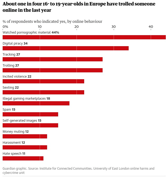
This, of course, triggered my bullshit radar, and this graph in the Guardian in particular caused a forehead sprain from raising my eyebrows too hard.

Graph from Guardian article displaying percentages of 16-19 year olds who have engaged in the following behaviours:
Watching porn - 44%
Piracy - 34%
Tracking - 27%
Trolling - 27%
Incited violence - 22%
Sexting - 22%
Illegal gaming marketplace - 18%
Spam - 15%
Self-generated images - 15%
Money muling - 12%
Harassment - 12%
Hate speech - 11%

Are you seeing what I’m seeing? Sticking watching porn or a poor-quality and free stream of a show right there alongside things like money laundering and hate speech? Let’s bear in mind that a sizeable portion of them are literally legally adults. You may also be wondering what some of these categories even are. We’ll get onto that later, because it’s funny as fuck.

Let’s take a look at the report in all its glory.

Sampling

Every dataset needs good sampling for good research. This pan-European study used 7,974 participants, which on the face of it sounds pretty good. The researchers identified eight regions to explore and aimed for 1,000 participants from each. The regions were the UK, France, Spain, Germany, Italy, the Netherlands, Romania and Scandinavia. You might spot that one of these things is not like the others, in that Scandinavia is not a country. But that’s the least of our problems.

In fact, over 37,000 participants were recruited into the study. Over 10,000 weren’t used in the analysis because they didn’t complete the survey; and almost 15,000 weren’t used because their responses were “low quality” (no information available as to how the research team assessed whether a response was low quality or not. Another 4,000 or so were excluded because they’d already hit quota limits – again, not any information as to how they chose which ones to exclude here, I’d assume it’d be the last ones to complete the survey from a specific region, but they don’t say so I could just make up any old shit.

So, the key takeaway is that the analysis was undertaken on about 20% of people who actually participated in the research. This is a bit of a shocker; while drop-outs can be expected, it’s generally not good practice to throw out almost 80% of your dataset.

I have a theory as to why drop-out was so astronomically high, though…

Multiple tests

The survey didn’t just measure these “deviant” behaviour variables (more on these later). It was, by the looks of all the measures they used, a heckin chonker of a survey, which also included the following measures and scales: the technical competency scale; the Emotional Impairment, Social Impairment, and Risky/Impulsive subscales of the Problematic and Risky Internet Use Scale; Adapted Risky Cybersecurity Behaviours Scale; an adapted version of Attitudes Towards Cybersecurity and Cybercrime in Business scale; the Toxic and Benign Disinhibition scales of the Online Disinhibition Scale; a few subscales from the Low Self Control scale; the Minor and Serious subscales from the Deviant Behaviour Variety scale; an adapted scale to measure deviant peer association; parts of the SD4 scale to measure “dark personality traits” of Machiavellianism, Psychopathy, Narcissism and Sadism; and also measures of anxiety, depression, and stress.

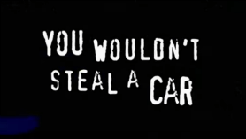
That is a lot of questions. A lot of participants would be bound to give up on it. And some are bound to not take a survey seriously if it asks you if you steal cars in one question, then goes on to ask if you’ve ever torrented a movie in the next. Come on. That’s literally this meme.

Still from a 00s anti-piracy advert. Text saying "you wouldn't steal a car".

The bigger problem of measuring so much, as the researchers did here, is that this means they’re conducting a hell of a lot of statistical tests, which raises the probability of something coming up as significant when it isn’t. The further problem is they barely report any results of any of the measures they did. This points to one of two dodgy research practices going on. It either reflects the “file drawer problem”, where research not finding anything does not get published, or “slice and dice”, where they’ll publish findings from the same dataset across multiple studies. Both are forms of publication bias, and both practices are fairly frowned-upon as they’re bad practice and make systematic reviewing of the research difficult.

Let’s look at the bit they actually did publish: the risky and criminal behaviours.

How are the behaviours defined?

The thing is, the definition of the behaviours in the study are pretty bad, too. Many are named in a way which sounds much worse than it is, for example “self-generated sexual images” in fact translates as “sending nudes” (or, as the researchers put it, “make and share images and videos of yourself that were pornographic”). ]

Others are just so broad as to be hilarious. A few favourites:
• Trolling is defined as “start an argument with a stranger online for no reason”.
• Tracking is “track what someone else is doing online without their knowledge”, which covers everything from stalking to looking at your ex’s instagram once in a while.
• Illegal trade of virtual items is buying or trading virtual items, a practice which is literally encouraged by some videogame brands.
• Digital piracy is “copy, upload or stream music, movies or TV that hasn’t been paid for”, which if you’re asking it this way, also includes things like watching youtube or free-with-ads content.

In short, some of the measured behaviours are very badly-defined and it is frankly a miracle that the numbers of young people doing these things are so low.

However, after doing yet more statistical tests, the researchers conclude that some of these behaviours cluster together. Do they?

Clusters of behaviours

The researchers conclude that, thanks to their research, “A significant shift from a siloed, categorical approach is needed in terms of how cybercrimes are conceptualised, investigated, and legislated.” Can they really support clusters of behaviour with their data? As far as I can tell, no.

There are many statistical methods for inferring clusters within data, ranging from techniques which look at “distance” between variables, to multidimensional scaling, to artificial neural networks. It’s a whole branch of mathematics.

The researchers used none of this veritable smorgasbord of algorithms, and instead ran a bunch of correlations as far as I can tell from their reporting. Then they somehow arrived on a cluster of the ones which had the biggest correlations with each other, for example, online bad’uns who are racist are also probably engaged in money laundering and revenge porn. It’s hard to tell exactly what they were doing, because the reporting of the method is very vague, but if they were using any of the multitude of established cluster analysis methodologies, they’d have probably mentioned that. When someone uses principal component analysis, they tell you about it because it’s a massive faff.

Conclusions from their conclusions

In short, what we have is a study with eyebrow-raising sampling methods, running multiple tests on the same dataset (without publishing the results of most of them), with some very weirdly-defined variables, and vaguely-described statistical methods. It’s not replicable. A journal probably wouldn’t print it, and indeed it wasn’t printed in any peer-reviewed journal.

It’s clear that the study authors had an agenda, which is always a bad place to come from when creating research; it generates bad research. Author Mary Aiken outright states the agenda in the Guardian report on the research:

“The online safety bill is potentially groundbreaking and addresses key issues faced by every country. It could act as a catalyst in holding the tech industry to account. The bill sets out a raft of key measures to protect children and young people; however, our findings suggest that there should be more focus on accountability and prevention, particularly in the context of young people’s online offending.”

Guardian, 5th December 2022

This is, essentially, a study which is manufacturing consent for the Online Safety Bill, a disastrously poorly-thought-out bit of legislation. And she’s out there saying “actually, it should probably be made worse because young people are internet criminals”.

This is worrying, to say the least, and yet it is entirely par for the course. The bill is a hot mess, and it needs some form of justification. This study, I don’t doubt, will be trumpeted around for some time, arguing that the delinquent kiddos need protection from themselves.

A huge thank you to some of the lovely people on Mastodon for talking this through with me (and sharing mutual snark). I probably wouldn’t have been inspired to write this many words about this without those chats. I’ve thanked a few who specifically helped in this post and there’s more quality snark and insights in the replies here.

_

Enjoyed what you read? Consider becoming a Patron or leave a tip